2025 Diaries + Calendars now available! Don't miss out - shop here!

2025 Diaries + Calendars now available! Don't miss out - shop here!

Blog

Welcome To Our Entrance!

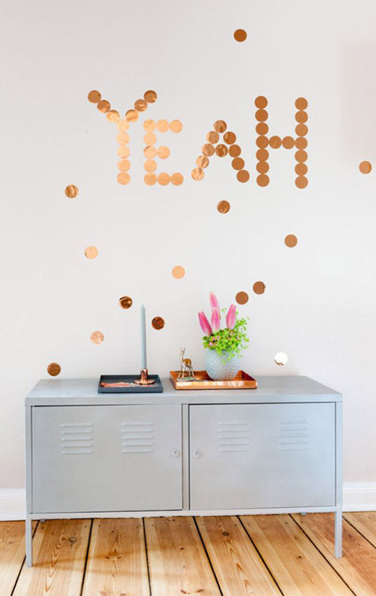
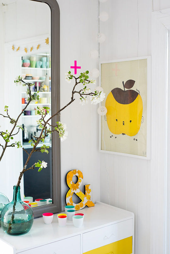
The entrance to your home should blow people away! O.k, that may be a little O.T.T but we are here to gently encourage (lecture) you on moving the muddy boots and bulky raincoats out of the road and inserting some serious style into the spot all your visitors are making their first impression of your house!

So, as recently mentioned, remove all old shoes, toys, junk mail and items you are planning on returning to people. This de-clutter will allow you to see the space clearly. Do you need a new console or buffet to help keep the area tidy? Or some baskets to put the shoes in? 

Is your entrance screaming out for a fab hall runner or rug to help define the space? 

We suggest placing an amazing artwork In your entry way. Every time you come into the house you will be reminded of how gorgeous your home is! 
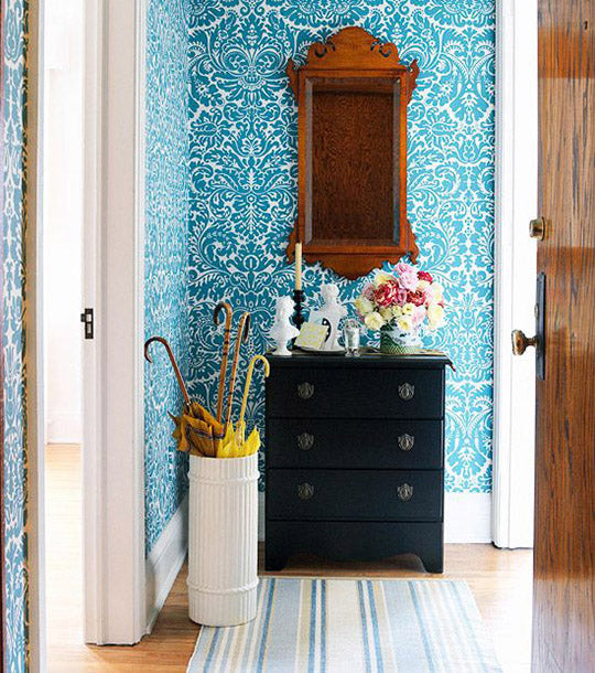
Images from: Better Homes and Garden Blog, vt wonen, design sponge, The Diversion Project, dawanda, Spacecraft Jumbled, Fjeldborg, The Cool Hunter, Jumbled online

Continue reading

Blogs We Love Featuring Fabulous Lighting

Pip was super inspired in Paris by all the fabulous lighting. In particular interesting bulbs, huge beaded chandeliers, feathered pendants and engineered hanging frames. It is seriously easy to add a WOW light to a space, but the experts suggest scale is the key. There is some great inspiration online and some seriously clever people writing blogs out there. Here we share some of our favourites with a focus on posts about feature lighting.

Left: Fabric covered drum pendants are so great. They look uniform in shape and yet offer intense colour and character to your room. Nordic Design is an awesome resource full of scandinavian inspired design, interiors, architecture and lifestyle. Check out our colourful drum pendants - at Jumbled Online they would look fab above a long dining table or a kitchen bench!

Right: Room Service lives up to its name. But instead of providing food, it provides gorgeous pictures of interiors, houses and other inspiring images from around the globe. Sit back, relax and enjoy the beauty from your lounge!

Left: Sheila from A Punch of Colour (need we say more!) says she loves the impact colour can have in design. How cool is this outdoor setting!! Re-create the look with our green beaded chandeliers.

Right: OEmily Henderson. You are so cute - her catch phrase is "perfection is boring, let's get weird" We are so down with that! This City House Tour features some great pendants and bulbs.

Left: This pic is from a fabulous blog - Seventh House on the Left, by Ashley and Greg Brown. It is just so gorgeous. They look like such a cute couple and all their posts are about renovating, decorating and living in their first home. Really fun.

Centre: Apartment Therapy is all about saving the world one room at a time. I do believe this feathered pendant would save my bedroom and at the risk of sounding a little crazy, I really, really, really, really need it now.

Right: This gorgeous blog 'sf girl by bay' is bohemian modern style from a San Francisco girl. Super cute, lots of great house pics and she loves colour. This pic comes from a post labelled 'Orange is the New Black' - we have a little crush forming!

Left: I don't know what I prefer more, the wallpaper or the gorgeous mushroom lamp! This fab french blog Planet Deco showcases beautiful interior decorations from around the world. Unless you can translate french fluently the writing won't be much good, however the pictures are inspiring!

Right: Wow... just wow. Design Tripper is definitely worth a look. It explores the intersection of travel and design with genuine curiosity and good taste.

Continue reading

Spacecraft Studio

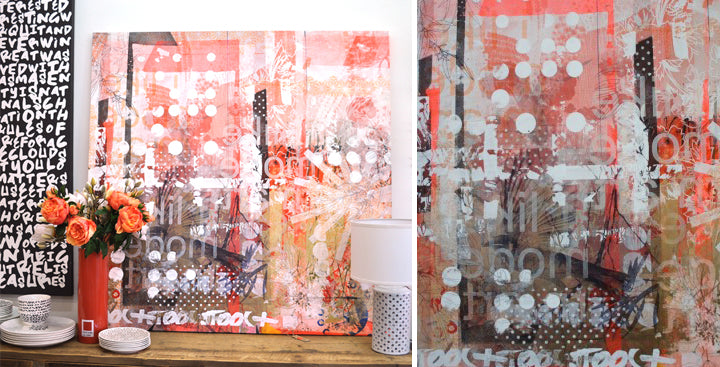
Spacecraft Studio was started by the designer, Stewart Russell. Working with all different artists, Stewart and his team at spacecraft create all sorts of pieces including cushions, cubes and artworks.

Spacecraft begun by creating a backing cloth. Layers upon layers of colourful paint were places onto the cloth. Each layer was applied by a different artist and therefore creating the work of many.

All artworks are unique and we are lucky enough to have some in store and online.

Polka backing cloth available online here.

Joost backing cloth available here

Continue reading

Tips from Abigail Ahern - Part 3 of 3

For our final part of the blog post, part three, we talk about soft furnishings, lighting, flowers and art.

Soft furnishings, like cushions are a five minute facelift for an interior. Mundane to magical. Take a look at our cushions available online here.

Lighting adds mood. It is the second most transformative element in a home. Think table lamps, candle lights and chandeliers. Shop lighting here.

Flowers... Oh we love them! Abigail is a fan of real and faux flowers. She suggests never to show the stems as they are boring. Have the flowers toppling over the vase. We have some flowers available online here.

Art injects personality into a room. It is also a perfect conversation starter. We love grouping pieces into a culstered fashion like Lucy did in The Design Files house.  Start collecting some new pieces of art here.

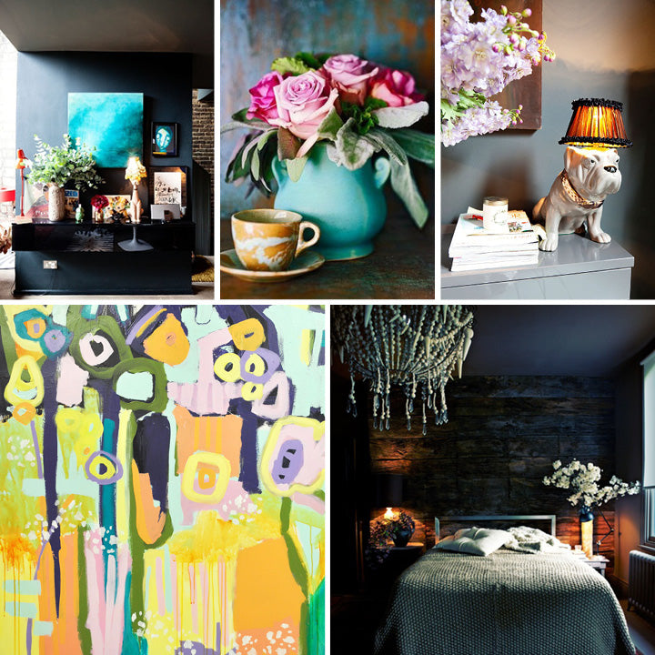
L to R:
One of Abigail's rooms, flower inspiration  from our pin board on Pinterest, Abigail loves odd lamps, an abstract work by Kezz Brett, a mood lit room by Abigail - more images by The Selby here.


Continue reading

Tips from Abigail Ahern - Part 2 of 3

Abigail provided us with so many wonderful tips we have divided this post into three sections. Take a look at our first part of tips here.

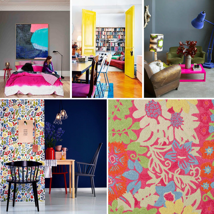
Following on... colour, pattern and texture can add depth to a space as does herbs and spices to cooking. It can take a space from bland to brilliant.

Colour:  Did you realise that paint and colour is the cheapest, most transformative tool to use in an interior? Neutrals can become cool when an odd/crazy colour, like neon pink, is added.

Pattern:  Abigail suggests to mix patterns in a similar colour pallet and your room will be elevated to another level.  Rugs with some sort of pattern are really important. We suggest our Dash & Albert rugs which are available online here.

Texture:  You can’t overdo. The more you mix the more exciting!

Need some pieces.. We are thinking our Dash & Albert rugs, the zig zag misty quilt cover from Kip & Co, the Dora cushion and Barton was the Master collage by Little Land of Pia which are all available online.

L to R:
Bedroom with a neon pink touch, living space with bright yellow doors, one of Abigail's rooms, a kitchen space with floral wall paper, Mia rug from Dash & Albert


Continue reading

Tips from Abigail Ahern - Part 1 of 3

Last week we were in Sydney and were lucky enough to hear the beautiful Abigail speak about interior decorating at the Decoration + Design Fair. We picked up some wonderful tips and want to share them with you. There are so many tips that we have divided this post up into three parts.

Abigail says that decorating transforms lives but you need to take some risks, make it personal and don’t follow trends.

For kitchens and bathrooms, Abigail suggests to accessorise with pieces that are not traditionally seen in these rooms. Think outside the box.. Think chandeliers, wall paper and art.

Try creating these looks with our lights and art pieces.

L to R:
Abigail Ahern, white kitchen with art feature piece, Kip & Co kitchen with copper light spotted in Real Living Magazine, a different bathroom, kitchen with a red chandelier, bathroom with antique sideboard

Continue reading
Tags
Back to top
p.pickup-availability-preview {display: none; visibility: hidden;}